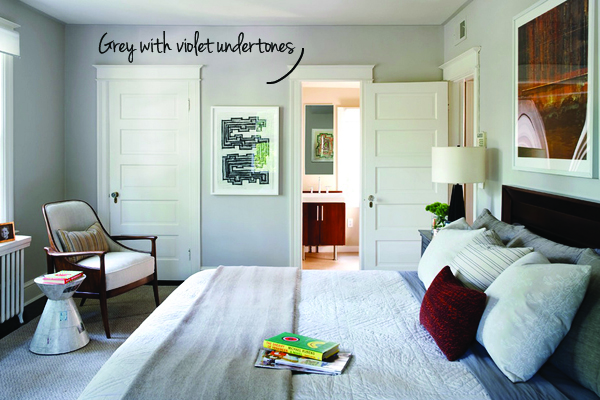
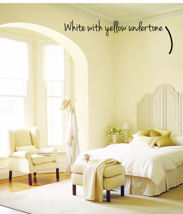
Nothing ruins a good design more than mismatched undertones. If you’ve ever walked into a space and something felt off, it probably wasn’t so much the colours, as it was the undertones.
Colours have both a mass tone and an undertone. The mass tone is the colour that is seen at first. Undertones can be a little more sneaky. They are often concealed if a colour is being viewed in isolation. But you can bet the bank that they will show up on a large wall, or when placed next to other colours.
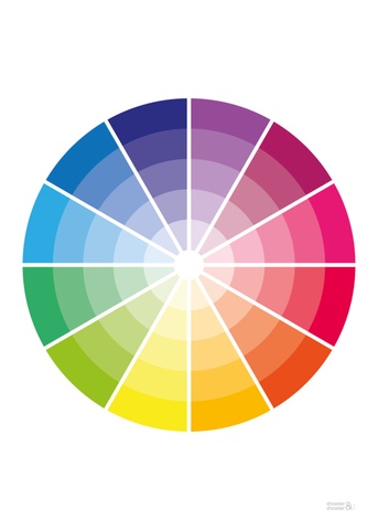
Remember in about grade two when you learned about colour wheels. Three primary colours of red, yellow, blue. If you had a patient teacher, she actually let you mix those colours to come up with the secondary colours of orange, green and violet. So you know that all colours are made from varying amounts of primary and secondary colours. Millions of fantastic beautiful colours can be created from mixtures of these and that is why they will carry an undertone of the strongest colour of the mix.
showlerandshowler.com
It takes lots of practice and a good eye to recognize the undertone of colour. And it’s not just paint you have to worry about. Counters, flooring, backsplash tile, fireplace stone…it’s important to have everything work in harmony. Most colour mistakes occur not in picking colours, but in not correctly identifying undertones.
As a designer who specs a lot of colour, I have my colour swatches broken into undertones. If a client says she likes blue, I am able to specify a blue that will work with her fixed colours such as flooring and furniture.
Hungry for more colour advice?
In case you missed it, take a look at our post on Gorgeous Greys.