 Kitchens and bathrooms are the most renovated rooms of the home and we’ve done our fair share of both.
This week I want to talk about Powder Rooms and how you can give this little talked about but much used room in the house an update.
Powder Rooms are like little jewel boxes. They can be over-the-top and no they don’t have to match the rest of the house. Let’s face it – this is a room with a quick in and out (or should be anyways).
Kelly Wearstler, who’s one of my favourite designers, loves to push boundaries and is fearless in her choices. She designed the now famous bathrooms at the Viceroy in Santa Monica.
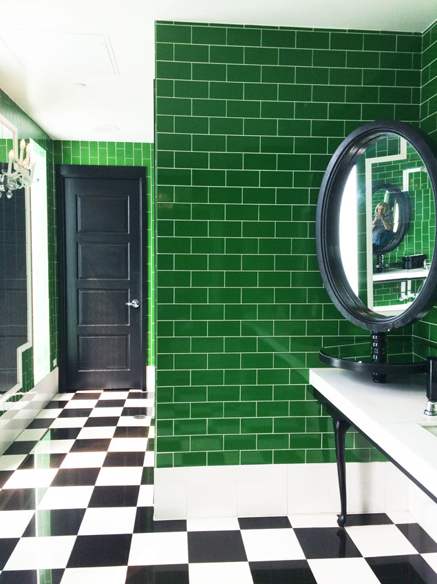
Don’t you love it when you walk into the restroom and the beauty overwhelms you? And ladies, when you find a good one, don’t you come back and tell your girlfriends to check out the beautiful facilities?
Well your powder room at home could be a space that everyone raves about. Kelly Wearstler certainly has no fears about going for it.
Check out these beauties by Kelly.
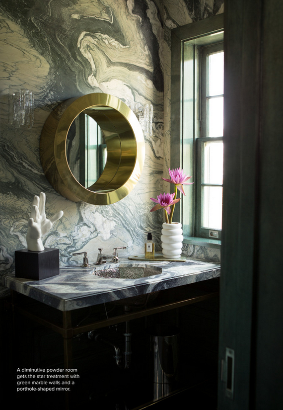
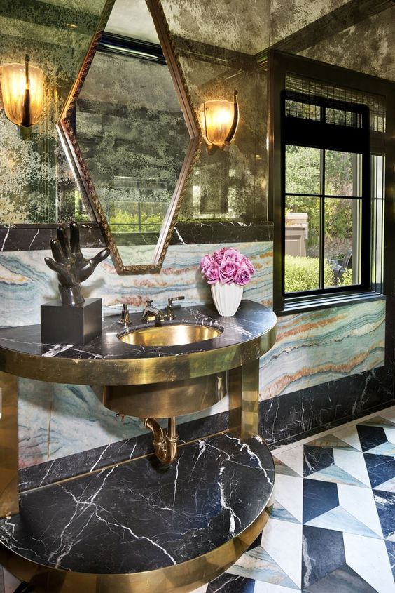
See what I mean about pushing boundaries and being fearless.
The amount of pattern she puts together is mind boggling, but somehow it all works. Her designs may be a little over the top for some, but they certainly are show-stoppers.
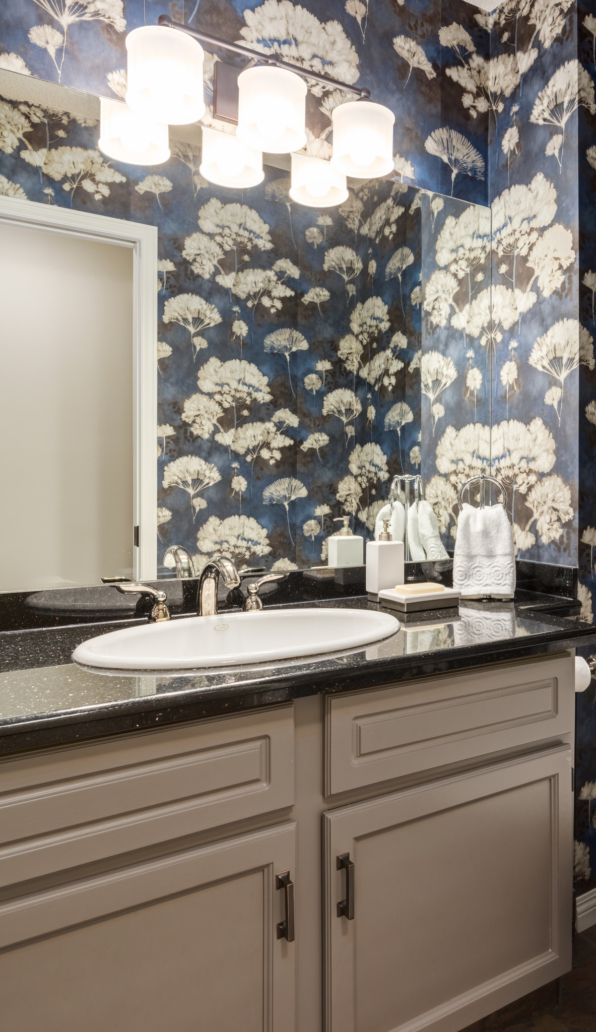
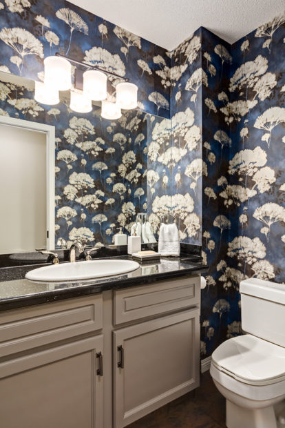
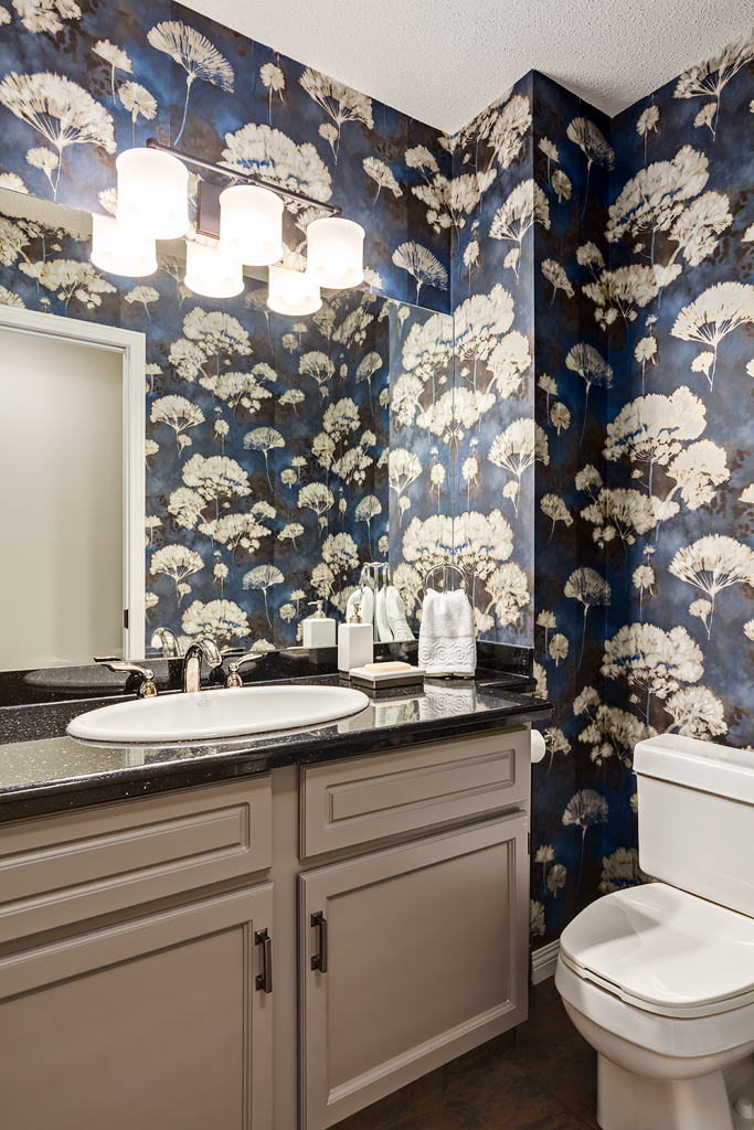
In the powder room above, we were asked if we could do an easy and affordable refresh. We were doing an extensive renovation of the kitchen and ensuite and this ate up most of the budget. The homeowner wanted this room freshened up so it wouldn’t look out of place beside the new kitchen.
I find the easiest way to make everything look new is to paint it, or add wallpaper.
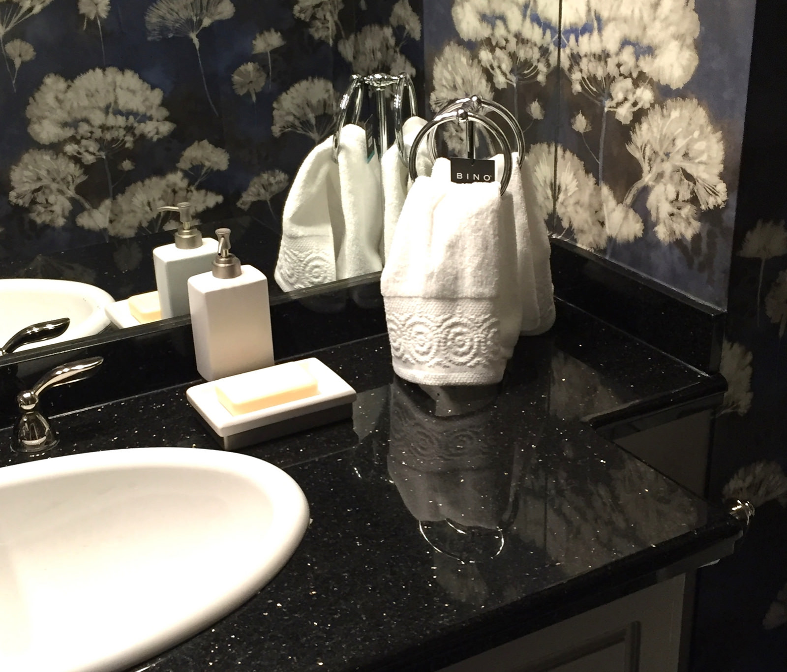
In this case, we decided to go with a striking wallpaper in deep shades of blue. The black granite counter top was not going to be changed so we needed to choose a paper that could hold it’s own with black.
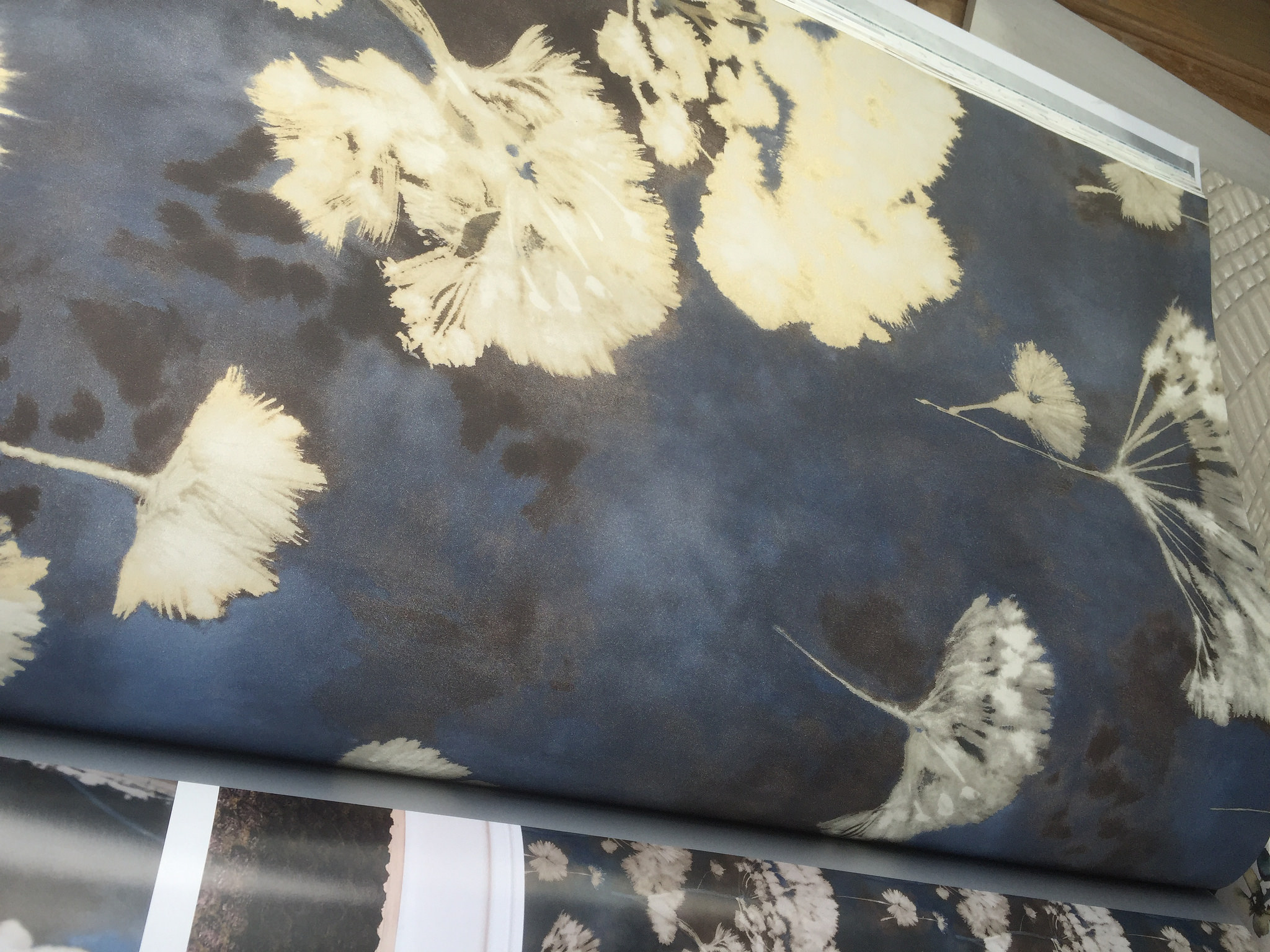
Using such a strong paper on the walls takes the focus off the cabinet. The existing cabinet was honey oak, but since it was in excellent shape, we decided to leave it and paint it a warm grey. Benjamin Moore Metropolis cc-546 is the colour that blended both with the granite and the paper.
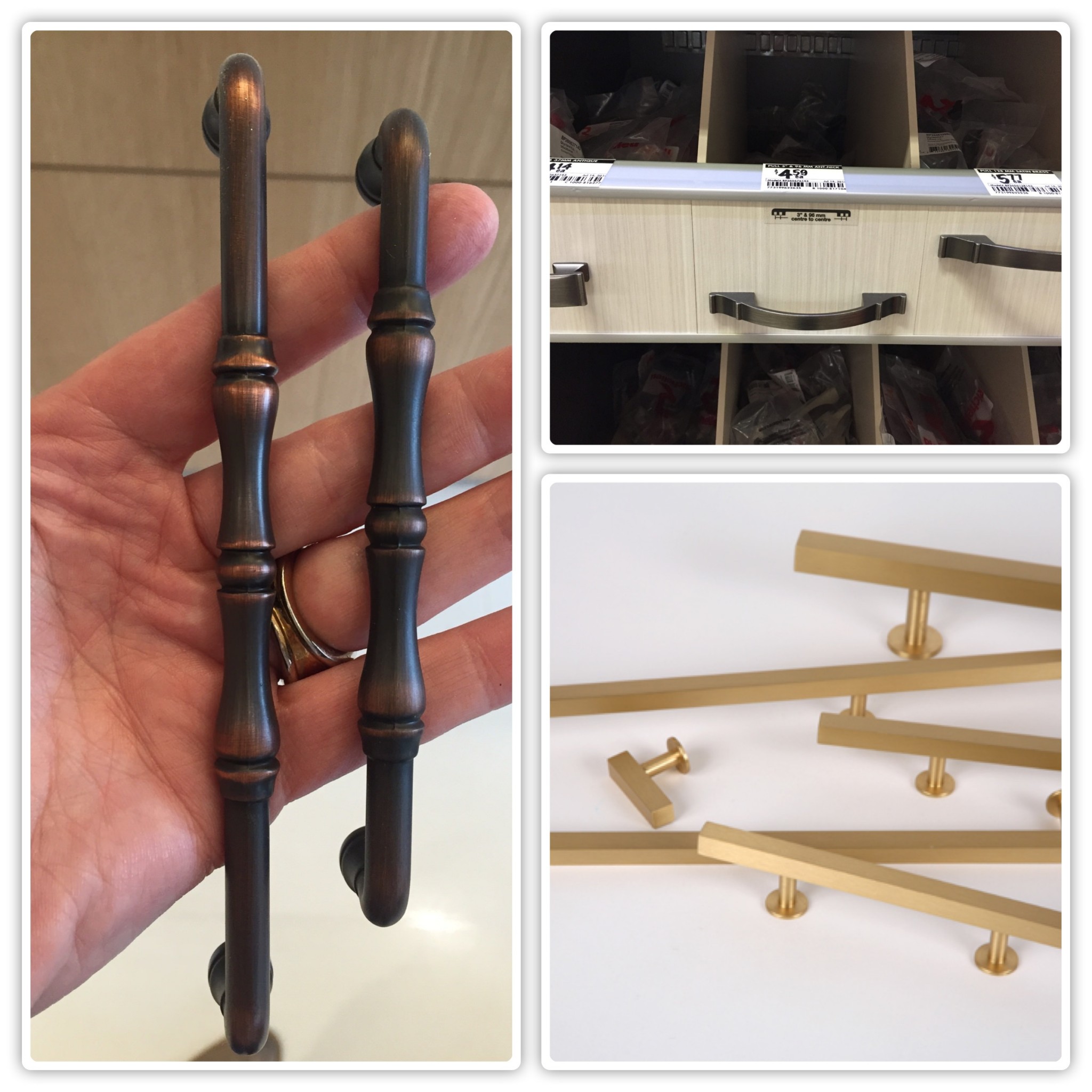
We choose new hardware for the cabinet. This might seem like a small detail, but it really does make a big difference. And we’re super picky when selecting the hardware. We search for the best one that will bring it all together.
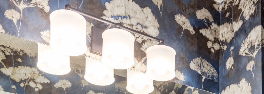
Next came lighting. I know that I say this all the time, but there can only be one star in a room. In this case, it’s the wallpaper grounded by the black granite. We wanted a simple light fixture that would give good light, and not overpower these two strong elements.
The toilet, sink and faucets were fine and since they were functioning well, we felt no need to change those out.
As far as decor went, we decided not to bring in colour, but keep the few accents all white. You can see that we’re trying out different towel holders to get the right look.
You got to admit, there’s nothing like thick luxurious white towels.
I think the main thing with a Powder Room is to have fun. Take a cue from Kelly Wearstler and be bold and fierce.
And remember, the powder room doesn’t have to flow with the rest of the house. It’s a room where you can explore the wilder side of design.
Related Posts:
